Redesigning When2meet to better meet students' needs.
Duration
Team
Tools
Disciplines
Sep - Dec 2020
4 months
UX Design Lead (me)
Engineering Lead
8 Software Engineers
Figma
Miro
Zoom
Google Surveys
Market Research
User Research
Product Strategy
Visual Design
BACKGROUND
Students often have to schedule meetings for group projects or extracurricular involvement. The scheduling tool used most often is When2meet. However, this platform isn’t the easiest to navigate. Thus, we wanted to redesign When2meet and add more features to make scheduling meetings more efficient.
CHALLENGE
How are students navigating the When2meet scheduling tool and how can we make the process more efficient?
SOLUTION OVERVIEW
RESEARCH PROCESS
To understand the current scheduling tool market, evaluate whether there was value in iterating on the When2meet tool, and understand the existing problems and pain points users are running into in the scheduling process.

Competitive Analysis

User Survey

User Interview
I spearheaded competitive analysis on similar products such as LettuceMeet, Calenderly, and Doodle to better understand the scheduling tool product space.
We learned that while there are many scheduling services, most free tools had very basic or minimal features and required the user to pay for advanced scheduling features.
I then collected 78 survey responses to understand how users currently used scheduling tools and their context; as well as pain points they ran into and features they would like to see.
I recruited 4 participants through convenient sampling to run a semi-structured interview and usability test on When2meet.
Analyzed data with an affinity diagram to learn about the existing problems and user pain points in When2meet.
RESEARCH INSIGHTS
Pain points when using When2meet
Confusing and Lack of Signifiers
Many participants did not know that they could change the month selector by dragging until prompted with a task
"
Wait, I didn't know you could drag to change the month!? - Participant 1
"
Convenience vs Organized
Participants found it convenient that When2meet didn't collect a lot of information, however, they tend to lose links since links are one-time use
"
When2meet feels very temporary… you only use it when you need so it's easy to lose track or lose links" - Participant 1
"
Unappealing Visuals
The design of When2meet is looks dated and has large unused screen real estate
"
The design looks dated - Participant 3
The design looks last century - Participant 2
"
SYNTHETIC MODELS
I synthesized two personas to focus on in our redesigned version of When2meet. We referred to these personas frequently throughout the design & development process, it helped align everyone on the features we wanted to prioritize.


Derek, 19
Nairobi, Kenya
Kira, 21
Vancouver, Canada
Derek is an international student who goes to school in Canada but is not physically located in North America due to COVID. He is has many group projects as part of his courses and is also the team lead of an engineering team.
Kira is a very involved science student and she is the president of the Biology Club. She works part time as a undergraduate researcher and has to meet weekly with her lab supervisor.
Goals/Needs
Goals/Needs
Find a weekly meeting time that works for his engineering team who are in different time zones
Schedule impromptu meetings for his group projects when needed
Spend less time figuring out when to meet
Find a set time for the Biology Club to have biweekly meetings
Set up weekly check-in meetings with her supervisor for research updates
Schedule meetings quickly so she can focus on other tasks
Technology
Technology
Mobile Phone, Laptop
Mobile Phone, Laptop
GOALS/DESIGN PRINCIPLES
Redesign When2meet for increased access & ease of use
I consolidated research findings and pain points into key design principles the solution would follow. This made communicating with engineers easier and helped the team prioritize what to build first.
Accessible to Users
Intuitive Design
Flexibility & Customization
Free of charge to users
Auto time zone conversion
Mobile optimized
Clean and intuitive UI
Clear signifiers, prompts, and CTA buttons
Improve on readability of “best time available”
Option to use without account
Option to create account for calendar integration (google, ical) and grouping links
DESIGN DECISIONS
Design Iterations and Rationale
VISUAL DESIGN
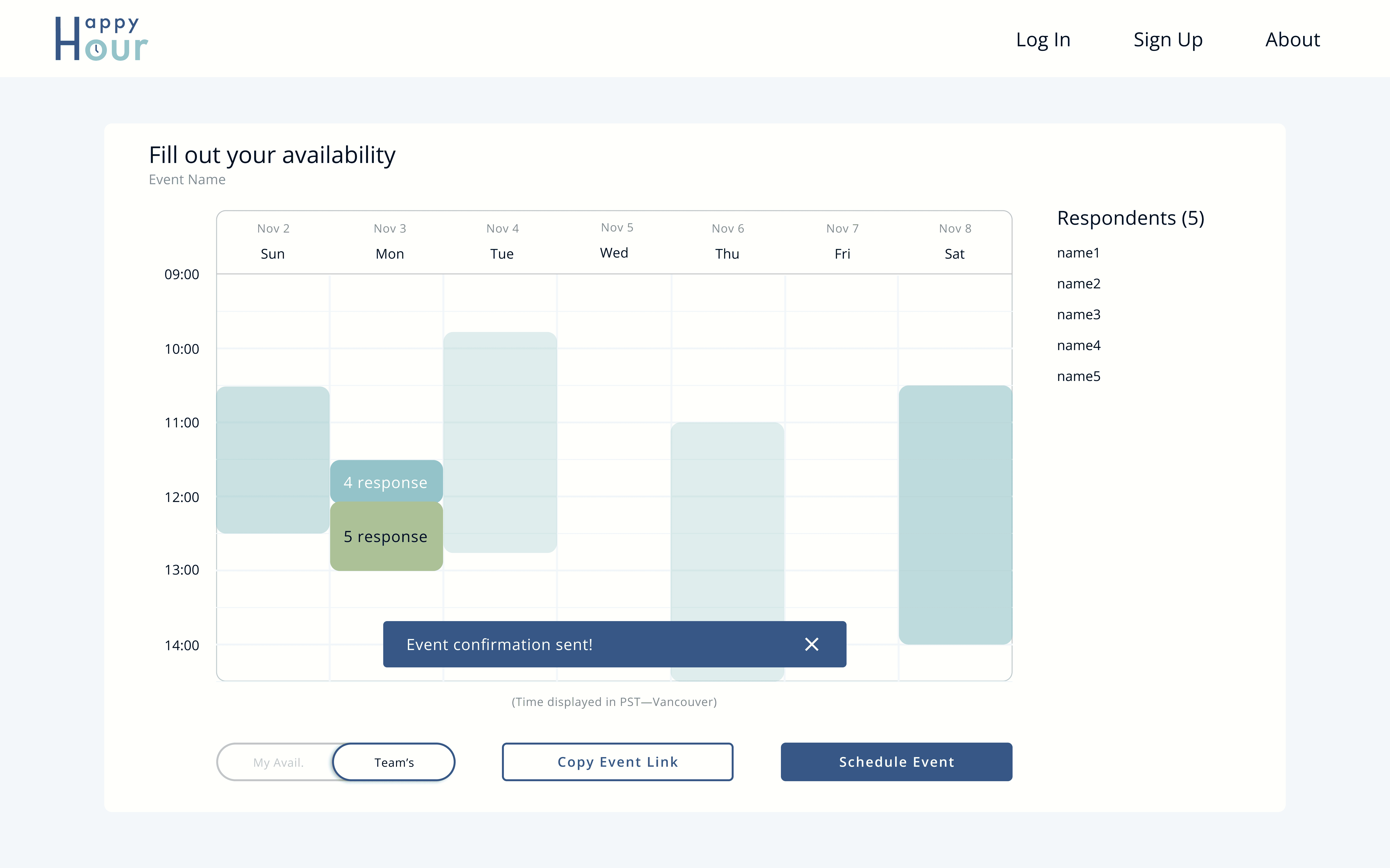
Final Design - Enhanced When2meet
After multiple rounds of user testing and changes to the prototype. This was the finalized design to be implemented in development.
CREATE EVENT
AVAILABILITY
SCHEDULE EVENT
IMPACT
4.6/5
2+ hrs
3M+
User Satisfaction Score
Saved Per Month
Users per year
LIMITATIONS & NEXT STEPS
Skewed sample population, may not be generalizable to public
User research was conducted within our school community (UBC), which may not be representative of other universities/colleges and the general public. Surveying and doing research with participants from a more diverse pool would make our product more generalizable.
Due to the lack of time and student responsibilities, we were not able to develop all the features before the school year ended. However, we were able to get the MVP running which was focused on event creation and calendar scheduling.
After product is launched, I would have liked to a/b test calendar visualizations. Although we went with a certain design, it would be interesting to see how different visualizations may effect task completion and user satisfaction.
REFLECTION
Value of bringing developers into the design/research process
Since I worked with a team of developers, a lot of them have not really had exposure to design or were aware of what user experience was. Thus, I tried my best to clearly explain the importance of research and presented my progress and designs every week to make sure the developers felt engaged in the project. I also invited them to join interview sessions and usability tests so they felt involved and understood the reason behind why I made certain design decisions/rationale.